Here's the new header and logo:

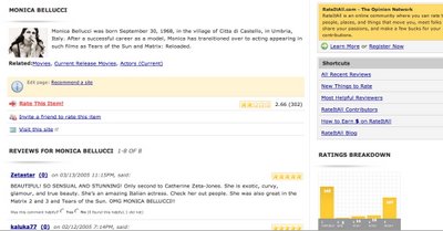
Here's what the item page will look like...

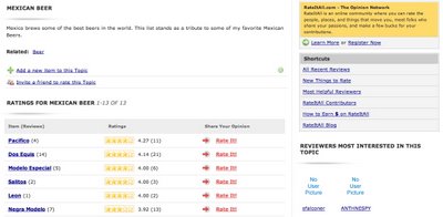
and here's the ratings list page (images not showing up yet, but they will):

here's a partial view of the profile page:

A discussion of RateItAll.com news, views, and direction.
Looks interesting.
ReplyDeleteThe design appears similar enough that it won't be too big of a shock to the long-time posters, yet updated enough to look, well, "refreshed".
The "reviewers most interested in this topic" segment on the ratings list page looks like a neat idea. The most different-looking part of it looks like the user page (somehow, the title of it saying "JonTheMan - male" is funny in its obviousness).
Yeah, the "JonTheMan - male" is a slight bit of overkill.
ReplyDeleteHere's how that display is going to work - we're adding three additional, optional fields to the profile page:
Relationship Status
Age
Location (city and state)
The display at the top of the profile page for someone who fields out those fields will be something like this:
About Rate-a-Holic - male, 24, and single (San Francisco, CA)
One other thing you may have noticed on the profile is Areas of Expertise.
We're launching something called "Expert Tags" where reviewers can identify the areas that they hold particular expertise. For example, mine would look something like this:
Burritos
Basketball
Philly
Beer
Then, the site is going to aggregate all these tags and display them all on a single page. Clicking on a specific keyword, say Burritos, will display all the RIA reviewers who claim to be expert in burritos.
I think it's going to be a neat way to find other folks who share your passions, as well as to find people to get a trusted recommendation from.
You can never be too careful when stating your gender on the internet...
ReplyDeleteAnyway, I'm looking forward to this "areas of expertise" addition. It should allow reviewers to more easily find reviewers with similar interests.
The redesign looks good, I'm looking forward to it!
ReplyDeleteThanks for the comments, guys. I'll put you all on the beta tester list... a password should be sent out no later than Friday.
ReplyDeleteI think the biggest difference that people will notice with the redesign is how much cleaner, and easier on the eyes it is. The font's bigger, there's more whitespace, and it's just generally a more user friendly lay out.
ReplyDeleteMy mom is always complaining about how tough to read RIA is... maybe I can finally get her on the site now, six years later :)
I agree the new look is more visually appealing and cleaner. Something tells me I'm going to like what is new.
ReplyDeleteCheers,
Andrew Scott
"Now, kids, don't play with your Rate-It-All so much, or you'll go blind!" hehehe.
ReplyDelete--kamylienne - angry asian chick, 25, and somehow still married (in the middle of nowhere, Florida)
And now you all know . . . THIS is why I need contacts!
ReplyDelete--Annie